
Wednesday, 24 March 2010

Research Into Target Audience (REVISED)
Identifying the target audience
Gender – both males and females are the target audience for my music video. Although, it will reach out to each gender differently depending on what they both ‘want’ from the media text. This is because the results from my research suggest both genders have an audience for this music genre, but they find out about the artist in different ways.
Social Class/occupation – although the majority of the participants who like the music genre were not in full-time employment, many of their aspirations were to go to university; the results suggest that the target audience could be in the C1 or C2 category in the social demographic pyramid in the near future.
Age – 16 out of 20 of the females and 15 out of 20 males claim to like the music genre, all within two age categories, 15-18 and 19-25 years old (this also shows within youth culture, the genre is a mainstream audience rather than niche). From these results it can be inferred that the main age range for the target audience is 15 to 25 years old.
Race/culture – randomly selecting participants who were walking around Norwich city centre resulted in a cultural bias; the participants, both male and female, were all white/Caucasian and British. From this research it can be assumed that the results are true for this race/culture, but not for other races/cultures.
Other music genre interests – for the male target audience is likely to be interested in Rock genre music, whereas the female target audience is likely to be interested in Pop genre music. It is important that the music video and digi-pack for the artist reaches out to both of these audiences equally.
Preferred methods of hearing about artists – for the male target audience the things that attract them to certain music most are word of mouth (the most important), then advertisements, then music videos, then finally attractiveness of the artist. For the female target audience the things that attract them to certain music is attractiveness of the artist (the most important) followed by advertisements, word of mouth and music videos all equally. This means the music video and digi-pack will need to attract both of these target audiences, but in different ways.
Methods of consuming music – the methods of which this target audience consume their music are approximately equal between genders. These methods are by CDs, YouTube, Limewire, Mp3 and computer.




Evaluation of Methodology:
To collect this data I chose to use a questionnaire; this enabled me to use closed questions in order to gather a range of quantitative data. The benefit of using a method which gives you quantitative rather than qualitative data meant that my results could be shown as statistics and be easily compared and generalised on to an audience/population.
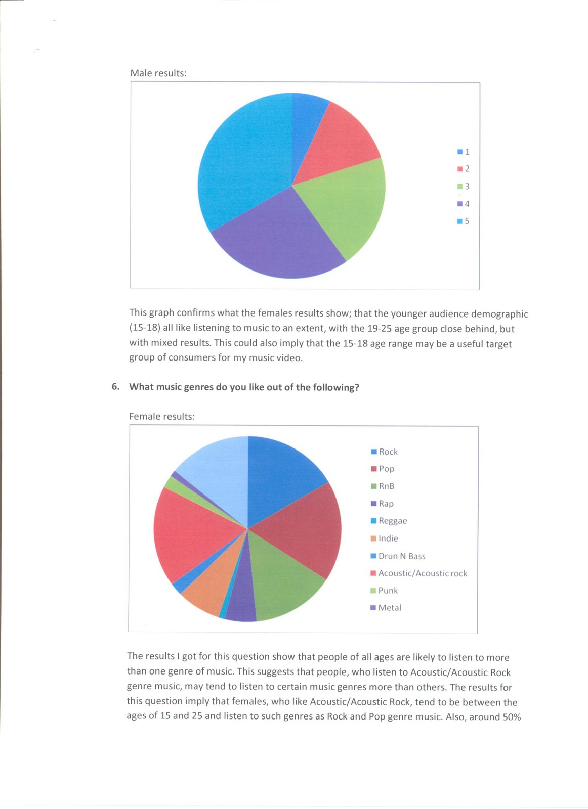
I chose to use ‘pie charts’ to present my data as they can be used to compare the results within the same pie chart, as well as being easily compared to other pie charts (e.g. comparing a pie chart of male results with a pie chart of female results, to show any differences and similarities.) Also, from the pie charts I was able to analyse the data into a document for presentation.
To help avoid demand-characteristics from the participants I made the questionnaires anonymous; this way the participants don’t feel the need to be untruthful about their answers.
To avoid getting bias results I chose to pick my participants randomly, but still have the same amount of each sex so that they can be compared. Having random participants meant not taking participants that are all friends or are all the same age; this means that the results are likely to be less bias, and therefore more reliable and generalisable to a population.


Monday, 15 March 2010
Digipack Magazine Advertisment
My advertisement would be put in such music magazines as NME. As well as NME magazine being widely popular, it is also host to most genres of music, from punk to pop; genre-wise, my ad would fit in with the magazine. Given the magazines popularity and the popularity of the other artists in the magazine, it would be likely that my artist would start attracting an audience.
I have made my ad colourful to attract peoples attention. Also, as my research suggested more people listen to the genre in the summertime, i have chose to make a cartoon image of a bright sun. The helps give the image a happy, light-hearted atmosphere, portraying the artists music as what it is. Also, the information on the ad is clear and readable, meaning that it is easy for everyone to read and get information about the gig if they are interested.
Here is my final advertisement design:
 Here are a few of the steps I took whilst creating the image:


Tuesday, 23 February 2010
Latest Digipack Ideas
Here is my idea for the album's front cover:

Here is my idea for the back of the CD booklet (the inside left image when the case is open):

Here is the image I hope to use for the inside right-hand side of the case, which would be behind where the CD is held:

Here is my design for the back of the album:


Here is my idea for the back of the CD booklet (the inside left image when the case is open):

Here is the image I hope to use for the inside right-hand side of the case, which would be behind where the CD is held:

Here is my design for the back of the album:

Album Cover Designs/Experiments
My first music video idea was set on a beach, so for my first album cover idea I incorporated the beach into the design; the beach would have related to the music video, and may be associated with the acoustic genre. Also, the use of a beach fire would have been useful in illustrating the name of the album 'Time For This Light To Shine'.
I started off taking photos of the beach at Sea Pauling near Norwich, but decided that although such images may be appealing to look at, they don't promote the artist or relate to the music or it's genre. Here is an example of the photos I took of the landscape:


I started off taking photos of the beach at Sea Pauling near Norwich, but decided that although such images may be appealing to look at, they don't promote the artist or relate to the music or it's genre. Here is an example of the photos I took of the landscape:

I also took photos of the fire, trying to capture an image with a dark surrounding so the fire stands out. The idea of having a beach fire meant the beach (and the fire) could be associated with the acoustic genre, but also the fire could relate to the name of the album. However, this too did not promote the artist himself. here is one of the photos of the fire I took:
I took photos of the artist next to the fire with his guitar. This was to try and use my initial idea of using the beach and the idea of using fire to go with the name of the album, but with the artist being shown and an acoustic guitar; this would help further enforce the acoustic genre connotation, and also promote the artist. Here is an example of the photos I took this way:

I tried to take the photos in time with when the fire gave of small embers from the top, so that the low shutter speed of the camera could capture lines of light coming from the fire rather than small specks of fire; the lines of light make the photo more attractive, but also go with the font I chose to use for the writing. The font I chose looks like glowing light/flames, and also as if someone has written it by waving a sparkler around - this goes well with the name of the album and also the images of the artist by the fire. However, the artists face is not clear enough in the images to successfully promote him on his first album, so I chose to think of a new idea. Here are two examples below:


Album Cover Research
Here are a few of the debut albums I found for acoustic artists. It has come to my attention that they all focus on the artist; they all focus on the artist's face. This may be to help promote the artist and get them well-known faster.
After realising this I decided to look into debut albums from other genres and found that there is a trend for artists' first albums to have a clear image of the artists face - then after they become well known, albums then start to focus less on the artists appearance and may use other designs.


After realising this I decided to look into debut albums from other genres and found that there is a trend for artists' first albums to have a clear image of the artists face - then after they become well known, albums then start to focus less on the artists appearance and may use other designs.


After deciding I would conform to the generic idea of using an image of the artist's face for my album cover, I came across Queen's first album (shown below). This uses images of the band members' faces, but in conjunction with a dark black background. This style gives the image a dark feel to it. As the album I am designing a cover for would be called 'Time For This Light To Shine' after the song I made a music video for, I thought it would be good advertising/promoting to incorporate the music video's narrative into the album cover. To do this I have decided to use the black background with faces idea from the Queen album. Instead of the blackness to give the album a dark connotation, I will use a image of candle-light with the faces to give the opposite feel; the use of light in the darkness, along with the name 'Time For This Light To Shine', gives the image the connotation of 'light' rather than dark. This 'light' with the two faces (the artist and his lover from the music video) suggests that there is a 'flame' between the two people (a relationship between the two people, as in the music video). Having the artist's face on the front cover and the girl's face on the back makes his identity stand out when people see the front cover - which helps to promote the artist and help people to start to recognise who he is. The black background also help make his face stand out, to attract attention to the album cover.
Subscribe to:
Posts (Atom)
